
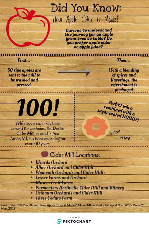
Reflecting on the different ways to tell the same story, it is apparent that data visualization is key to luring in a reader/ viewer. As demonstrated above, I took two different approaches to displaying information. In one way the article link above, titled, “Did You Know: How Apple Cider is Made” by Ben Freed, provides the information necessary to the reader in paragraph form of the process, history, and locations of Ann Arbor, MI cider mills. From this article, I utilized my design skills to recreate the information provided in the article to produce an inforgraphic. To do this, I took the highlights of the article and summarized them into captions, along with graphic images to become more attractive to the reader. I selectively included icons that were simple and representative of the article. In addition, I only used short burst of context that was directly drawn from the article.
There are many pros and cons to utilizing different methods of displaying information. For instance, the article is much more informative than the infographic. This is largely due to the fact that the infographic was drawn from the article and only allows the reader to visually see the information that the designer utilized. On the other hand, the infogrpahic is capable of drawing in more viewers due to the pictures provided and the less overwhelming feel of the information being displayed. The overall objective of this comparison was to analyze how different perspectives/ ways of displaying information could be simplified and to see the effectiveness of each.
In terms of persuasiveness and effectiveness, the infographic surpassed the test. Continuing, the infographic was able to supply viewers with the information in a timely manner and without strenuous comprehension. The infographic was much more appealing with the utilization of pictures and without the intervention of advertisements listed in the margin. Lastly, the infographic was less overwhelming, thus making it more persuasive because of the interest in obtaining information without much thought.
In the end whether utilizing the article or infographic, it is important to note the differences of each data visualization perspective, but even more important to understand the process of an apple to become apple cider.
